ユニファ開発者ブログ

ユニファ株式会社プロダクトデベロップメント本部メンバーによるブログです。

Experimental method for Bio-Data augmentation using only two observations for deep learning applications.

By Matthew Millar R&D Scientist at ユニファ

This blog will show a new experimental method for data augmentation geared towards bio-science for deep learning. This is important for several reasons. 1: Collecting data is time-consuming especially in collecting large enough observations for training deep learning models. 2: It can be difficult to collect or sample enough observations due to the lack of access or chances to make collections. 3: Collecting observations can only be done at certain times or during certain periods, or the period of time for sampling has passed so the collection of further/more observations are impossible. 4: There are few species available to collect samples from. These are just 4 simple reasons why data augmentation is needed for biological studies.

Methods for Data Augmentation

The simplest method for data augmentation is to match the generated data both statistically and logically to the observed data. This means that the data that is generated should have a similar look and feel of the real-world data. The two data sets should have similar distributions, mean, modes, etc. to ensure that the data truly simulates the observed sequences. The simulated data should also be logically like the data that is observed. This means that the simulated data should not have outliers model into it as this will confuse any model. The augmented data should flow alongside the observations and almost mirror each observation. But, just copying the real observations is not an appropriate method for data augmentation. The observations should change slightly. For example, common methods for data augmentations in CNN are image rotation, flipping, cropping, changing color, etc. to create “new” unseen images for a CNN to be trained on. This is also true for numerical data, but not as easy as just flipping the numbers from 10 to 01 as they are not the same.

There are very few methods that exist for data augmentation for numerical data. There are even fewer geared specifically towards biodata or biostudies. This blog will show a new method for generating near-infinite observations based simply on the minimum and maximum observations in a data set.
The data set that I am using is a publicly available data set of Body Measurements (BDIMS)(Heinz, Peterson, Johnson, & Kerk, 2003). This data set is the girth and skeletal measurement of 247 men and 260 women.


Now let's get into the coding aspect of it:

CODE

First, let's get all the import statements out of the way.

import numpy as np 
import pandas as pd 
%matplotlib inline
import matplotlib.pyplot as plt
import pymc3 as pm
import theano
from statsmodels.formula.api import glm as glm_sm
import statsmodels.api as sm
from pandas.plotting import scatter_matrix
from random import randint

Next, we need to do some quick examination of the data we downloaded.

# Read the data in from the csv file
data = pd.read_csv("bdims.csv")
print(data.columns)
Index(['bia.di', 'bii.di', 'bit.di', 'che.de', 'che.di', 'elb.di', 'wri.di',
       'kne.di', 'ank.di', 'sho.gi', 'che.gi', 'wai.gi', 'nav.gi', 'hip.gi',
       'thi.gi', 'bic.gi', 'for.gi', 'kne.gi', 'cal.gi', 'ank.gi', 'wri.gi',
       'age', 'wgt', 'hgt', 'sex'],
      dtype='object')

Now we know the colum names. Lets get rid of some of the data we dont want to make it simpler and easier to use.

filter_data = data.filter(['sex','hgt','wgt', 'che.gi','hip.gi', 'kne.gi','thi.gi', 'ank.gi', 'wri.gi', 'wai.gi' ], axis=1)
print(filter_data.head())
   sex    hgt   wgt  che.gi  hip.gi  kne.gi  thi.gi  ank.gi  wri.gi  wai.gi
0    1  174.0  65.6    89.5    93.5    34.5    51.5    23.5    16.5    71.5
1    1  175.3  71.8    97.0    94.8    36.5    51.5    24.5    17.0    79.0
2    1  193.5  80.7    97.5    95.0    37.0    57.3    21.9    16.9    83.2
3    1  186.5  72.6    97.0    94.0    37.0    53.0    23.0    16.6    77.8
4    1  187.2  78.8    97.5    98.5    37.7    55.4    24.4    18.0    80.0


Much nicer. Now we only want to look at one subject as this is biological data. So we will filter out females from males and just look at males. This process will work on both sexes as the steps will be the same, but doing both at the same time will yield poor results as there are biological differences between males and females in general.

# Split between male and female 
male_mask = filter_data['sex'] > 0
male = filter_data[male_mask]
female = filter_data[~male_mask]
# After sperating the two exes lets drop the sex collumn as we dont need it
male = male.drop(['sex'], axis=1)
male.describe()

                 hgt	wgt	che.gi	hip.gi	kne.gi	thi.gi	ank.gi	wri.gi	wai.gi
count	247.000000	247.000000	247.000000	247.000000	247.000000	247.000000	247.000000	247.000000	247.000000
mean	177.745344	78.144534	100.989879	97.763158	37.195547	56.497976	23.159109	17.190283	84.533198
std	7.183629	10.512890	7.209018	6.228043	2.272999	4.246667	1.729088	0.907997	8.782241
min	157.200000	53.900000	79.300000	81.500000	31.100000	46.800000	16.400000	14.600000	67.100000
25%	172.900000	70.950000	95.950000	93.250000	35.750000	53.700000	22.000000	16.500000	77.900000
50%	177.800000	77.300000	101.000000	97.400000	37.000000	56.000000	23.000000	17.100000	83.400000
75%	182.650000	85.500000	106.050000	101.550000	38.450000	59.150000	24.300000	17.850000	90.000000
max	198.100000	116.400000	118.700000	118.700000	45.700000	70.000000	29.300000	19.600000	113.200000

Now with the first step of preprocessing, we can get into the process of creating the dataset from only two points! These two points will be the minimum and maximum based on height. Height is chosen because this variable is the dominating variable in biology and bio-mass. Weight is normally heavily dependant on height (pun intended). The dependent variable will be weight. (X = height Y = weight).
So let's find the smallest and largest person in the dataset.

# Find the smallest item based on height 
# Create a new dataframe of the smallest and larget
min_max_male = pd.DataFrame(male[male.hgt == male.hgt.max()]) 
min_max_male = min_max_male.append(male[male.hgt == male.hgt.min()])
# Sort by height
sort_min_mix_male = min_max_male.sort_values('hgt')
print(sort_min_mix_male)
           hgt   wgt  che.gi  hip.gi  kne.gi  thi.gi  ank.gi  wri.gi  wai.gi
105  157.2  58.4    91.6    91.3    35.5    55.0    20.8    16.4    80.6
126  198.1  85.5    96.9    94.9    39.2    54.4    27.5    17.9    82.5
ax1 = min_max_male.plot.scatter(x='hgt',y='wgt',c='DarkBlue')

f:id:unifa_tech:20190805162245p:plain
Max Min Plot
So the first and simplest method to interpolation is linear regersion. This will give us a few extra points of missing data.

# Now use linear regression to fill in some of the missing points
import numpy as np
from sklearn.linear_model import LinearRegression
x = np.array([min_max_male.hgt.min(),min_max_male.hgt.max()]).reshape((-1, 1))
y = np.array([min_max_male.wgt.min(), min_max_male.wgt.max()])
# Define a linear regerssion model
model = LinearRegression()
model.fit(x, y)
r_sq = model.score(x, y)
print('coefficient of determination:', r_sq)
print('intercept:', model.intercept_)
print('slope:', model.coef_)
coefficient of determination: 1.0
intercept: -45.75941320293397
slope: [0.66259169]

Now to make new points.

prediction = []
gen_height = []
for i in range(int(min_max_male.hgt.min()), int(min_max_male.hgt.max())):
    new_x = np.array(i).reshape((-1, 1))
    gen_height.append(i)
    pred = model.predict(new_x)
    prediction.append(pred[0])

print(len(prediction))
print(len(gen_height))
print(prediction[0])
print(gen_height[0])
41
41
58.267481662591706
157
# Lets plot the results
import matplotlib.pyplot as plt

old_min_hgt = min_max_male.hgt.min()
old_max_hgt = min_max_male.hgt.max()
old_min_wgt = min_max_male.wgt.min()
old_max_wgt = min_max_male.wgt.max()

plt.plot(gen_height, prediction, 'ro')
plt.plot(old_min_hgt, old_min_wgt, 'bo')
plt.plot(old_max_hgt, old_max_wgt, 'bo')
plt.show()

f:id:unifa_tech:20190805162711p:plain
Linear Regression
Ok looks fine so far. The blue dots are the original data (min and max) and the red dots are the newly generated data. This makes sense as weight should increase as height increases. But, not really. There are variations in weight because of other factors. Also, 41 new points don't make a deep learning set.
Lets create a few more points:

# Now lets fine tune the hieght veriable by a float instead of a int
# We can resue the linerar regression model to generate more data
# Go from 41 observations to 409000 observatsions 
# All equally possible to occure in the real world
current_hgt = min_max_male.hgt.min()
count = 0
large_hgt = []
while current_hgt <= min_max_male.hgt.max():
    # increase the height by 0.1 cm
    current_hgt +=0.0001
    large_hgt.append(current_hgt)
    count +=1
print(len(large_hgt))

409000

# Now using the newlly generated fine scale height lets get the weight
large_pred = []
for h in large_hgt:
    new_x = np.array(h).reshape((-1, 1))
    pred = model.predict(new_x)
    large_pred.append(pred[0])

print(len(large_pred))

409000
# Now lest plot everything again

plt.plot(large_hgt, large_pred, 'go')
plt.plot(gen_height, prediction, 'ro')
plt.plot(old_min_hgt, old_min_wgt, 'bo')
plt.plot(old_max_hgt, old_max_wgt, 'bo')
plt.show()

f:id:unifa_tech:20190805163104p:plain
Larger Dataset

As you can see perfectly overlaps and each observation makes sense and is logical.
The blue dots are the original, the red is the first step, and the green is fine-tuned steps.
This jumps from 2 observations (min and max) to 41 observations (fully synthetic) to 409000 observations.
But in the real world, biology does not always follow a linear line
Let's introduce some variability into the data generation!

# Define a new line using all the data from the real data set
# Define a linear regerssion model
X = np.array(male.hgt).reshape(-1, 1)
Y = np.array(male.wgt).reshape(-1, 1)

model2 = LinearRegression()
model2.fit(X,Y)
r_sq2 = model2.score(X,Y)
print('coefficient of determination:', r_sq2)
print('intercept:', model2.intercept_)
print('slope:', model2.coef_)
coefficient of determination: 0.28594874074704446
intercept: [-60.95336414]
slope: [[0.78256845]]
# Linear regresion using real data
y_pred = model2.predict(X)
# Now plot all the data
plt.plot(X, y_pred, color='blue', linewidth=3)
plt.plot(male.hgt, male.wgt, 'yo')
plt.plot(large_hgt, large_pred, 'go')
plt.plot(gen_height, prediction, 'ro')
plt.plot(old_min_hgt, old_min_wgt, 'bo')
plt.plot(old_max_hgt, old_max_wgt, 'bo')
plt.show()

f:id:unifa_tech:20190805163445p:plain
Real Data
As you can see the regression line is some what close to the line of data that is generated. It is not perfect and there will be a lot of variability between the two datasets. But seeing that this is only based on two observations, (the min and max) the lines are pretty close. The intercept and slope are close enough to use the ones found from the two points only. So let us continue and make a fully synthetic deep learning dataset from two observations.

# The slope of the line is b, and a is the intercept found from Sklenar linear model
# Simple Linear regressoin model Y = a + bX that will be the model for out MCMC
alpha =  -45.75941320293397 # Intercept
beta = [0.66259169] # Slope
X = np.array(large_hgt)
Y = np.array(large_pred)
print(len(X))
print(len(Y))

409000
409000

# Weight Histogram
hist = male.hist(column='wgt')

f:id:unifa_tech:20190805163840p:plain
Real Data Histogram

#Normal distribution. mu is the mean, and sigma is the standard deviation.
# Seeing that the weight is normally distributed (basically) we can use that knowledge to generate new data via a normally
# Distrubuted method

#for random.normalvariate(mu, sigma)
std = np.std(X, axis=0)
real_std = np.std(male.wgt, axis=0)
print(std)
print(real_std)
11.806813005284504
10.491587167890629

temp_min_max = []
temp_min_max.append(male.wgt.max())
temp_min_max.append(male.wgt.min())
mean = np.mean(temp_min_max)
real_mean = np.mean(male.wgt)
print(mean)
print(real_mean)
85.15
78.14453441295547

Looking at the mean and standard deviation they are close enough for this example. Lets make a Million data points for our new dataset! That should be enough for any deep learning dataset.

new_X = []
new_Y = []
for i in range(0,1000000):
    index = randint(0, len(X) -1)
    new_X.append(X[index]) 
    new_Y.append(np.random.normal(mean,std))
plt.plot(new_X, new_Y, 'go',marker='^')
plt.plot(male.hgt, male.wgt, 'yo')
plt.plot(large_hgt, large_pred, 'go')
plt.plot(gen_height, prediction, 'ro')
plt.plot(old_min_hgt, old_min_wgt, 'bo')
plt.plot(old_max_hgt, old_max_wgt, 'bo')
plt.show()      

f:id:unifa_tech:20190805164134p:plain
A Million Data points!
Well thats no good. Now to be fair, given a infinate number of samples, it is highly likely that at least for each point there would have been someone that mathces the height and weight on this chart, but that is like using a shotgun to fish. It is not as accurate and not really following the regression line of the real data which means that the dataset is not useful and cannot be used in a deep learning model as it wont learn anything.
So how can we fix this?
Let's perform some rejections by using a concept of banding. So if the observation falls outside the bands it won't get plotted. The bands themselves set up an upper and lower limit so that all predictions will have to fall within these limits. To form these limit expert knowledge of the observed phenomenon is needed especially for only two observations, luckily for us, we have more than two observations so we can define out limits based on the full real dataset.

# Use upper and lower limits to reject samples
def make_sample(lower, upper, mean, std):
    sample = np.random.normal(mean,std)
    if lower < sample < upper:
        return sample
    else:
        make_sample(lower, upper, mean, std)

# Define bands for each interval
# The more bands the finer the level of rejection
# Each item in the array is defined as
# [band lower, band upper, lower limit, upper limit]
band1 = [0, 155, 50, 70]
band2 = [156,160, 55, 70]
band3 = [161, 165, 56, 75]
band4 = [166, 170, 57, 80]
band5 = [171, 175, 60, 88]
band6 = [176, 180, 60, 94]
band7 = [181, 185, 60, 100]
band8 = [186, 190, 63, 105]
band9 = [191, 195, 64, 110]
band10 = [196, 299, 65, 110]
# Put all the bands into a single array for easy use
bands = []
bands.append(band1)
bands.append(band2)
bands.append(band3)
bands.append(band4)
bands.append(band5)
bands.append(band6)
bands.append(band7)
bands.append(band8)
bands.append(band9)
bands.append(band10)

new_X = []
new_Y = []
for i in range(0, 1000000):
    index = randint(0, len(X) -1)
    for band in bands:
        if band[0] <= X[index] <= band[1]:
            new_X.append(X[index]) 
            new_Y.append(make_sample(band[2], band[3], mean, std))
                    
    
plt.plot(new_X, new_Y, 'go',marker='^')
plt.plot(male.hgt, male.wgt, 'yo')
plt.plot(large_hgt, large_pred, 'go')
plt.plot(gen_height, prediction, 'ro')
plt.plot(old_min_hgt, old_min_wgt, 'bo')
plt.plot(old_max_hgt, old_max_wgt, 'bo')
plt.show()   

Which gives us this!

f:id:unifa_tech:20190805164757p:plain
Banded Data
There are still a million points, but some my be repeated. But, the general flow is far more similar to the real data which is perfect now for training a deep learning model.

Conclusion

From this blog, we saw how to use only two observations, the minimum and maximum, and how to create a fully synthetic dataset that can be used for deep learning.
The main idea when building a fully synthetic dataset is to ensure it is statistically and logically similar to that of the observed/real dataset. This gives the benefit of creating a large training dataset and then using the real data as a testing set. This can give very good results when creating a deep learning model as you won't have to train the model on the very limited (and precious) real data that can be very difficult to capture or collect.

This approach can be improved significantly, especially in the banding section. By adding a larger number of bands, smoothing out the lower and upper limits, and even using more complex algorithms like a random walk can improve the final results. But, this method still needs to be vetted before use in different models and/or real-world applications. The next step would be to model more independent variables, other phenomenons, and improve the generation steps.

References:

Heinz G, Peterson LJ, Johnson RW, Kerk CJ. 2003. Exploring Relationships in Body Dimensions. Journal of Statistics Education 11(2).

ひらがな練習アプリを作ってみる

こんにちは。iOSエンジニアのキムです。ユニファの開発ブログでは初の投稿になります。よろしくお願いします。

私は4才の娘がいますが、娘が最近ひらがなに興味を持つようになり、読み書きの練習としてアプリを作ってあげることにしました。 今日はそのアプリについて簡単に紹介させていただきたいと思います。

準備

今回作ったアプリは、画面上にひらがなの文字が表示されて、指でなぞって線を描くようなシンプルなアプリです。あとは、画面に表示されている文字を音声で読み上げる機能も入れてみました。指でなぞって線を描く機能ではUIBezierPathを使っています。また、音声機能はAVSpeechSynthesizerを使っています。

処理内容

iOSでは指で画面をなぞることでタッチイベントが発生します。 今回はタッチイベント発生時にUIBezierPathを使って線を描画します。 以下のような流れになります。

touchesBegan(_:with:) タッチ開始時

override func touchesBegan(_ touches: Set<UITouch>, with event: UIEvent?) {
    if let touch = touches.first?.location(in: self) {
        path = UIBezierPath()
        path?.lineWidth = 30
        path?.lineCapStyle = .round
        path?.lineJoinStyle = .round
        path?.move(to: touch)
    }
}

touchesMoved(_:with:) タッチしたまま指を移動

override func touchesMoved(_ touches: Set<UITouch>, with event: UIEvent?) {
    if let touch = touches.first?.location(in: self) {
        path?.addLine(to: touch)
        setNeedsDisplay()
    }
}

touchesEnded(_:with:) タッチした指が離れる

override func touchesEnded(_ touches: Set<UITouch>, with event: UIEvent?) {
    if let touch = touches.first?.location(in: self) {
        path.addLine(to: touch)
        setNeedsDisplay()
    }
}

AVSpeechSynthesizerを使ってテキストを読み上げる処理

func speak(string: String) {
    self.speechSynthesizer = AVSpeechSynthesizer()
    let utterance = AVSpeechUtterance(string: string)
    utterance.voice = AVSpeechSynthesisVoice(language: "ja-JP")
    utterance.rate = AVSpeechUtteranceMinimumSpeechRate
    utterance.pitchMultiplier = 1
    self.speechSynthesizer.speak(utterance)
}

// 利用方法
speak(string: "あ")

上記では日本語を指定していますが、指定がなければ端末の言語設定が適用されます。 また、声の高さや文字を読み上げるスピードなども変更できます。

イメージ

f:id:unifa_tech:20190722154745g:plain

最後に

子供に作ったアプリを見せたら大喜びで遊んでました。が、3日くらいで飽きてしまったようで今は使ってくれません・・・。 今後も子供のために何か面白いアプリを作ってあげたいなと思います。

Keras Functional API

By Matthew Millar R&D Scientist at ユニファ

What is Keras functional API?

Most people are used to the Sequential model from Keras as it is a straightforward method for creating simple models. The functional API is Keras way of creating far more complex models. This can allow for the creation of models with multiple inputs and outputs, different types of inputs, merging inputs, having two loss functions, and more.

Code Comparison:

So, let’s look at the most basic model possible. Using the MNIST dataset that is already included in Keras is an easy model and dataset that is available for everyone and should need no introduction. So I will skip the setup, loading, and training-test splits of the data and go into the model. The below code is a basic setup for a Sequential model to learn how to recognize handwritten numbers. This code sample comes from the Keras team GitHub [1].

model = Sequential()
model.add(Conv2D(32, kernel_size=(3, 3),
                 activation='relu',
                 input_shape=input_shape))
model.add(Conv2D(64, (3, 3), activation='relu'))
model.add(MaxPooling2D(pool_size=(2, 2)))
model.add(Dropout(0.25))
model.add(Flatten())
model.add(Dense(128, activation='relu'))
model.add(Dropout(0.5))
model.add(Dense(num_classes, activation='softmax'))

model.compile(loss=keras.losses.categorical_crossentropy,
              optimizer=keras.optimizers.Adadelta(),
              metrics=['accuracy'])

model.fit(x_train, y_train,
          batch_size=batch_size,
          epochs=epochs,
          verbose=1,
          validation_data=(x_test, y_test))

Easy right? Now we can build a similar model using the Functional API from Keras. Looking at them compared side by side, they are very similar. But now you don’t need Sequential to be defined.
First, we will need to import a few more modules:

from keras.layers import Input, Dense
from keras.models import Model

These modules are needed for the Functional API.
Then we need the first part defines the input shape much like this from the original Sequential model.

# Sequntial way
model.add(Conv2D(32, kernel_size=(3, 3),activation='relu',input_shape=input_shape))
# Which is the same as
# Functional API
inputs = Input(shape=(input_shape))
# Define the Conv2d Layer
x = Conv2D(32, kernel_size=(3, 3),activation='relu')(inputs)

The next lines are the same as they start building out the architecture. So, they have the same setup. The next difference is the output this is where you define the output and the model.

predictions = Dense(num_classes, activation='softmax')(x)
model = Model(inputs=inputs, outputs=predictions)

The last layer (prediction) is pretty much the same as the last Fully connected layer in the basic model.
So you should end up with something that looks like this:

# Define input shape as the input Reuse the original inputshape
inputs = Input(shape=(input_shape))
# Define the Conv2d Layer
x = Conv2D(32, kernel_size=(3, 3),activation='relu')(inputs)
x = Conv2D(64, kernel_size=(3, 3),activation='relu')(x)
x = MaxPooling2D(pool_size=(2, 2))(x)
x = Dropout(0.25)(x)
x = Flatten()(x)
x = Dense(128, activation='relu')(x)
x = Dropout(0.5)(x)
predictions = Dense(num_classes, activation='softmax')(x)

# This creates a model that includes
# the Input layer and three Dense layers
functional_model = Model(inputs=inputs, outputs=predictions)
functional_model.compile(loss=keras.losses.categorical_crossentropy,
                         optimizer=keras.optimizers.Adadelta(),
                         metrics=['accuracy'])
functional_model.fit(x_train, y_train,
          batch_size=batch_size,
          epochs=epochs,
          verbose=1,
          validation_data=(x_test, y_test)) 

Results:

As you can see from the scoring the two methods produced pretty much the same results. The added advantage though with the Functional API model is that it is more extendable and far more customizable. When performing a more complex task, the use of the Functional API may be mandatory as a single Sequential model cannot handle the complexity of it.
Now, what is the point you may say? The biggest benefit is not the model defined above can then be used as another layer in another model like so:

x = Input(shape=(input_shape))
pred = functional_model(x)

That will produce the classification results of any input that is sent in. This can be used to aid a classification into a video feed, or a more complex model needed multiple types of inputs.
Trining of the models behave the same as well and yield similar results too.

Sequential Model Training.
Train on 60000 samples, validate on 10000 samples
Epoch 1/12
60000/60000 [==============================] - 211s 4ms/step - loss: 0.2604 - acc: 0.9208 - val_loss: 0.0589 - val_acc: 0.9797
Epoch 2/12
60000/60000 [==============================] - 203s 3ms/step - loss: 0.0870 - acc: 0.9746 - val_loss: 0.0395 - val_acc: 0.9868
Epoch 3/12
60000/60000 [==============================] - 202s 3ms/step - loss: 0.0648 - acc: 0.9800 - val_loss: 0.0374 - val_acc: 0.9879
Epoch 4/12
60000/60000 [==============================] - 201s 3ms/step - loss: 0.0541 - acc: 0.9837 - val_loss: 0.0395 - val_acc: 0.9868
Epoch 5/12
60000/60000 [==============================] - 203s 3ms/step - loss: 0.0465 - acc: 0.9857 - val_loss: 0.0275 - val_acc: 0.9907
Epoch 6/12
60000/60000 [==============================] - 206s 3ms/step - loss: 0.0407 - acc: 0.9879 - val_loss: 0.0288 - val_acc: 0.9900
Epoch 7/12
60000/60000 [==============================] - 203s 3ms/step - loss: 0.0381 - acc: 0.9887 - val_loss: 0.0258 - val_acc: 0.9925
Epoch 8/12
60000/60000 [==============================] - 212s 4ms/step - loss: 0.0337 - acc: 0.9897 - val_loss: 0.0298 - val_acc: 0.9900
Epoch 9/12
60000/60000 [==============================] - 211s 4ms/step - loss: 0.0311 - acc: 0.9901 - val_loss: 0.0257 - val_acc: 0.9927
Epoch 10/12
60000/60000 [==============================] - 211s 4ms/step - loss: 0.0290 - acc: 0.9909 - val_loss: 0.0264 - val_acc: 0.9918
Epoch 11/12
60000/60000 [==============================] - 206s 3ms/step - loss: 0.0271 - acc: 0.9916 - val_loss: 0.0254 - val_acc: 0.9922
Epoch 12/12
60000/60000 [==============================] - 201s 3ms/step - loss: 0.0265 - acc: 0.9918 - val_loss: 0.0278 - val_acc: 0.9920
Functional API Trainig
Train on 60000 samples, validate on 10000 samples
Epoch 1/12
60000/60000 [==============================] - 213s 4ms/step - loss: 0.2768 - acc: 0.9142 - val_loss: 0.0583 - val_acc: 0.9812
Epoch 2/12
60000/60000 [==============================] - 205s 3ms/step - loss: 0.0947 - acc: 0.9721 - val_loss: 0.0477 - val_acc: 0.9842
Epoch 3/12
60000/60000 [==============================] - 202s 3ms/step - loss: 0.0696 - acc: 0.9802 - val_loss: 0.0363 - val_acc: 0.9883
Epoch 4/12
60000/60000 [==============================] - 203s 3ms/step - loss: 0.0566 - acc: 0.9831 - val_loss: 0.0319 - val_acc: 0.9893
Epoch 5/12
60000/60000 [==============================] - 201s 3ms/step - loss: 0.0495 - acc: 0.9854 - val_loss: 0.0331 - val_acc: 0.9892
Epoch 6/12
60000/60000 [==============================] - 202s 3ms/step - loss: 0.0432 - acc: 0.9864 - val_loss: 0.0293 - val_acc: 0.9904
Epoch 7/12
60000/60000 [==============================] - 205s 3ms/step - loss: 0.0393 - acc: 0.9879 - val_loss: 0.0284 - val_acc: 0.9903
Epoch 8/12
60000/60000 [==============================] - 196s 3ms/step - loss: 0.0341 - acc: 0.9893 - val_loss: 0.0273 - val_acc: 0.9916
Epoch 9/12
60000/60000 [==============================] - 202s 3ms/step - loss: 0.0319 - acc: 0.9900 - val_loss: 0.0249 - val_acc: 0.9919
Epoch 10/12
60000/60000 [==============================] - 210s 3ms/step - loss: 0.0297 - acc: 0.9904 - val_loss: 0.0324 - val_acc: 0.9898
Epoch 11/12
60000/60000 [==============================] - 212s 4ms/step - loss: 0.0285 - acc: 0.9911 - val_loss: 0.0248 - val_acc: 0.9922
Epoch 12/12
60000/60000 [==============================] - 209s 3ms/step - loss: 0.0272 - acc: 0.9915 - val_loss: 0.0283 - val_acc: 0.9921

And the final results are the same as well.

Sequential
Test loss: 0.027761173594164575
Test accuracy: 0.992
Functional
Test loss: 0.028270527327229955
Test accuracy: 0.9921

A Better Example! Image Similarity:

This model will use a ResNet50 pre-trained model to create the vectors used for image comparison. For each image, the features will be calculated and then merged into on input for the Fully Connected layers. But, honestly, any CNN will work you can even define your own CNN and use it to extract features. The final layer will produce a probability that the two images are similar or not based on a threshold. This model will not do very complex comparisons as it is too simple. But for images of scenery, it should get satisfactory results.
The basic model for image similarity can be done like this:

input_shape = (224, 224, 3)
base_network = resnet50.ResNet50(weights='imagenet', include_top=False, input_shape=input_shape)

input_1 = Input(shape=(input_shape))
input_2 = Input(shape=(input_shape))

vector_1 = base_network(input_1)
vector_2 = base_network(input_2)

# Get the distance between images
merged = Lambda(absdiff, output_shape=absdiff_output_shape)([vector_1, vector_2])

fc1 = Dense(1024)(merged)
fc1 = BatchNormalization()(fc1)
fc1 = Dropout(0.4)(fc1)
fc1 = Activation("relu")(fc1)

fc2 = Dense(2048)(fc1)
fc2 = BatchNormalization()(fc2)
fc2 = Dropout(0.4)(fc2)
fc2 = Activation("relu")(fc2)

fc3 = Dense(4096)(fc2)
fc3 = BatchNormalization()(fc3)
fc3 = Dropout(0.3)(fc3)
fc3 = Activation("relu")(fc3)

fc4 = Dense(4096)(fc3)
fc4 = Activation("relu")(fc4)

fc5 = Flatten()(fc4)
pred = Dense(2, kernel_initializer="glorot_uniform")(fc5)
pred = Activation("sigmoid", name="A_2")(pred)

model = Model(inputs=[input_1, input_2], outputs=pred)

model.compile(optimizer='adam', loss="binary_crossentropy", metrics=["accuracy"])
NUM_EPOCHS = 10
history = model.fit_generator(train_gen,
                              steps_per_epoch=num_train_steps,
                              epochs=NUM_EPOCHS,
                              validation_data=val_gen,
                              validation_steps=num_val_steps,
                              verbose = 1)

Conclusion:

Now can you see the usefulness of Functional API in Keras? This is just the tip of the iceberg on what can be accomplished with this API. There are many more possibilities to be had.
This API is not limited to images but can be used to define any complex model with multiple inputs and outputs. Using for natural language processing or even complex analysis of the stock market where there are numerical and nonnumerical data used in the same model.

バーンダウンチャートにはどんな数字を含めるべきか?

スクラムマスターの渡部です。

スクラムでは、プロジェクトの進捗管理や問題の把握にバーンダウンチャートを使うのが良い(相性が良い)と言われています。

私のチームもスクラム開発の例に漏れずバーンダウンチャートを使用しているのですが、導入当初、少し悩んだことがありました。

それは、「バーンダウンチャートに含めるべき数字とは何か?」ということです。

今回の記事では、私自身の失敗と、「こう考えてやっているよ!」ということをお伝えできればと思います。

本記事で解説する内容
  • バーンダウンチャートに含めるべき数字とは何か?
想定読者
  • 開発で、既にバーンダウンチャートを使われている方(もしくは、使おうとしている方)

どんな悩みを抱えていたのか?

まず、バーンダウンチャートとは、縦軸に全タスクの残り時間(ストーリーポイントなど)を置き、横軸を期間(スプリントなど)で区切ったチャートです。

f:id:unifa_tech:20190716111532p:plain
バーンダウンチャートの例

スクラムの教科書では、「チームがやるべき作業を全てバックログに積むべし」との教えがありましたので、 プロジェクト内/外問わず、全ての作業をバックログにいれ、見積もりをして、完了したらその分、チャートをバーンダウンさせていました。

しかし、2〜3スプリントも完了するかどうかというときに、ふと疑問が生じました。

「元々予定してなかったタスクを後から追加して、それで着地予想は正確になるのか?」と。

次のセクション以降では、上記について私が考えたことを説明していきます。

以降の説明で使用する前提

  • プロジェクトで必要な全タスクの見積もり合計:100pt
  • チームが1スプリントで完了できるポイント数:10pt
  • 既存サービスの運用・Bug修正・その他調査系のタスクは「プロジェクト外タスク」と呼称
  • 過去3スプリントの平均ベロシティを計算し、予測線(赤色)としてチャートに表示

パターンA:プロジェクト外タスクは一切無し

まずは、3スプリント経過時点でチャートに予測線を引いてみます。

予測

f:id:unifa_tech:20190716112056p:plain
パターンAの予測

チームの3スプリント平均が10ptですので、今後も10ptずつ完了されていくと仮定すると、チャートは上記のようになります。 では、時間を進めて結果を見てみましょう。

結果

f:id:unifa_tech:20190716112207p:plain
パターンAの結果

このパターンでは、特に問題は見られませんでした。

パターンB:プロジェクト外タスク有り(2pt / スプリント)

次に、1スプリントごとに2ptのプロジェクト外タスクが追加されるパターンで見てみたいと思います。

予測

f:id:unifa_tech:20190716112512p:plain
パターンBの予測

追加されたプロジェクト外タスクはバックログに追加していますので、全タスクの見積もり合計が増えています。 今回も、3スプリント平均は10ptですから、今後も10ptずつ完了されていくことは妥当に思えますので、予測線はスプリント毎に10pt完了で表示しています。

とすると、3スプリントを終えて残り76ptですので、スプリント11にはプロジェクトは終えられるでしょうか? 時間を進めて結果を見てみます。

結果

f:id:unifa_tech:20190716112834p:plain
パターンBの結果

なんと、予想から2スプリント後ろにずれてしまいました。何故でしょうか?

ここで、チャートに表示している数字の内訳を見てみたいと思います。

f:id:unifa_tech:20190716113428p:plain
バーンダウンチャートの内訳

そうです。 チームが完了していた10ptの内、8ptしか、プロジェクトで必要なタスクを完了できていないにも関わらず、10pt完了する予測にしてしまっていたことが原因でした。

試しに、8ptずつ完了される想定でチャートを引き直して見ます。

予測(8ptずつ完了)

f:id:unifa_tech:20190716113840p:plain
パターンBの予測(8ptずつ完了想定)

スケジュールは予想と実績で一致していますので、これであれば、より正確に予想ができそうです。

パターンC:プロジェクト外タスク有り(5pt / スプリント)

念の為、極端な例として、1スプリントごとに5ptのプロジェクト外タスクが追加されるパターンで予測と結果を見てみたいと思います。

予測

f:id:unifa_tech:20190716114029p:plain
パターンCの予測

結果

f:id:unifa_tech:20190716114113p:plain
パターンCの結果

スケジュールについては予想と結果が一致していますので、問題は解決できたと思います。

ですが、予測時に、実績と予測の線の傾きが異なりすぎて、直感的にイメージしにくく、他の違和感にも気づきにくいチャートになってしまっています。

これは、実績線ではプロジェクト内/外の全タスクで完了したポイントを含めているのに対し、予測線ではプロジェクト内タスクのみを含めていることが原因です。

その差を解消するためには、実績線・予測線ともに、プロジェクト内タスクのみを含める必要があります。

パターンD:プロジェクト外タスク有り、プロジェクト内タスクのみ集計

パターンCの問題を解決するため、プロジェクト内タスクのみを含めたチャートで、予測と結果を見ていきたいと思います。

予測

f:id:unifa_tech:20190716115238p:plain
パターンDの予測

結果

f:id:unifa_tech:20190716115450p:plain
パターンDの結果

スケジュールも予測と結果が一致しており、予測線の傾きも直感的にイメージできるものになっているかと思います。

結論

上記でいろいろ試した結果、私はタスクの種類(プロジェクト内タスク or プロジェクト外タスク)によって、バーンダウンチャートに含めるか否かを判断するのが使いやすいかなと考えています。

ルール
  • 下記にはプロジェクト内タスクのみ含める
    • バックログ(見積もり合計)
    • 実績線
    • 予測線
備考

ただ上記ルールにすると、プロジェクト外タスクにどれだけチームのリソースを費やしているのかがわかりませんので、次のようなグラフも併用すると良いと思います。

f:id:unifa_tech:20190716121229p:plain

横軸にスプリント、縦軸にポイント数を置き、スプリント毎で完了されたポイントの内、プロジェクト内or外タスクがどれだけあったのか?また、どのように推移しているかを見えるようにしたものです。

さいごに

私のチームでは、上記のように考えてデータの見える化に努めていますが、 「もっと良いやり方あるよ!」とか「こんなツール使うと便利だよ!」等ありましたら、ぜひぜひコメントで教えていただけると嬉しいです。

もしくは、一緒に働きながらカイゼンしていきませんか?

ユニファでは、「世界中の家族コミュニケーションを豊かにする」ことに共にチャレンジしていく新たな仲間を積極的に募集しています!

recruit.jobcan.jp

カルチャー・ハッカー

デザインチームの三好です。

私は理論的思考の要素が薄い為、全体を通して感覚的、つまりふわっとした内容及び文面になることを初めにお伝えしておきます。

台湾文創

文創という言葉。これは「文化創意」の略であり、現代の台湾でよく使われている表現です。今台湾は高い感度と軽やかな実行力を持つ若い世代を中心に物凄いスピードで新たなカルチャーを構築しています。

私は文化が構築されていく過程をどうしても自分の肌で感じてみたくなり、ふらっと1人で3日間台湾を歩いてきました。既存のステレオタイプな台湾のイメージをひっくり返すような革命の片鱗を求めて探し歩いて、実際にそれが息吹いているところを確かに感じることができました。

台湾人は表現することへの純度が高く、良くも悪くもためらわずに突っ走る行動力を備えています。 それらを武器に彼らは今まさに自国そのものを”ハック”していると感じました。

" ハッカーとは壁の一部が破れるはずだと常に考えている人のことである " ジョン・ウィルスフェアー

ハッカーという言葉の意味。一般的には大いに誤解されて浸透しています。

コンピューター上で悪事を働く不正利用者のイメージがそのままハッカーとなったようですが本来は「コンピューター技術にたけて工夫ができる人」という意味になります。 ただこの場でコンピューター上のマニアックな話をするわけではなく(というよりもできない)、ハックという言葉をもっと日常的な広い意味で考えていきたいと思います。

どうやら、特に海外ではこのハックという言葉が流行ってしまっているようで「生きているだけで地球をハックしてる」「呼吸をして空気をハックしよう」など意味不明な軽いノリで使われ完全に本来の意味が崩壊していますが、真のハッカーとは『創造力を発揮して既存の常識を破壊し新たな価値観を再構築していく、挑戦を続ける人』だと私は思っています。

マイノリティ・パワー

今台湾でその動きが見られているとはいうものの、それは少数の限られた人たちが発信している印象です。こういったカウンターカルチャーは社会の主流に反するものなので大々的に表舞台に現れることは殆どありません。(ビートジェネレーション、ヒッピー文化、パンクサブカルチャーのような歴史上の大きなうねりは例外ですが)

そのかわりに彼らの精神は自由で、余計な束縛を受けず、本当に表現したいことを強い意志で伝えることができます。

マジョリティに媚びないからこそ実現できるものがあることを知っています。

それでも一部ではありますが台湾の新たな風がヨーロッパや日本にもじわじわと浸透してきているところをみると彼らの試みは少しずつ成功してきているのだと思います。

企業の内側をハックする

この流れを個人的な話に置きかえてみると、自分自身を含めインハウスデザイナーというものは「企業の内側をハックする」必要があると感じています。まずはこのブログの場で誤解されがちである『デザインという言葉の意味』を浸透させることから始めていきたいと思いますが、長くなりそうなのでその話は次の機会に。

カルチャーやクリエイティブなどという言葉を使うとクリエイター職以外には無縁のように感じるかと思いますが、今は日常的にどのシーンにおいても創造性が求められる時代です。 デザイナーなどはただ単にそれを色濃く目に見える形で発信する職種であるというだけの話で、根本的には特別なものではなくどの職種にもデザイン要素は含まれていると私は思っています。

そしてそれがとても重要であるものということへの意識の底上げをすることもインハウスデザイナーの役割と考えています。

さぁ、レッツハック。

f:id:unifa_tech:20190711110931j:plain

Local Binary Pattern for Local Texture Feature Extraction

By Matthew Millar R&D Scientist at ユニファ

This blog will look at how to build a Local Binary Pattern feature extractor for computer vision tasks.

Local Binary Pattern:

What is LBP
LBP is one of many feature extractors. HOG, SIFT, SURF, FAST, DoG, etc... are all similar but do slightly different things. What makes LBP different is, its main goal is to be used for a texture descriptor on a local level. This gives a local representation of any texture of an image. This is done by comparing a pixel with the surrounding pixels. For each pixel in an image, the surrounding x number of pixels will be looked at. X can be determined and adjusted as needed. The LBP value for every pixel is calculated to its neighbors. If the center pixel is greater than or equal it's neighbor's values, then it will be set to 1, else it will be set to 0.

f:id:unifa_tech:20190704165824p:plain
LBP pixel calculation

From the above talbe, you can see how each cell gets calculated. From this point this 2D array will be flattened to a 1D array like this:

f:id:unifa_tech:20190704170013p:plain
1D Array

This will give
 2^6 + 2^2 + 2^1 + 2^0
 64 + 4 + 2 + 1 = 71
So 71 will be in the output image. This process will be done for every single pixel in the image.

This talbe shows how each cell is calculated:

f:id:unifa_tech:20190705101452p:plain
Table Calculation

The basic idea behind this is to calculate each value of the 1D array at each index.
The value is determined by the position of the index in the array. If the value at the index is a 1, then value calculated to be  2^i where i is the index position. If the value at the index is 0, then the value is set to a 0 regardless of the index position. Then you sum the results of the whole 1D array to get the center pixel value.
To get the feature vectors from this, you have to calculate a histogram first.
This will be a histogram of 256 bins as the values of the LBP can range from 0 to 255.

Python Implementation:

OpenCV does have an LBP available, but it is meant for facial recognition and would not be appropriate for getting textures off clothing or environments. The use of the sklearn’s model can be very useful then for this project.
Let see how to implement it.

from skimage import feature
from sklearn.svm import LinearSVC
from sklearn.linear_model import LogisticRegression
import numpy as np
import cv2
import os

class LBP:
    # Constructor
    # Needs the radius and number of points for the outer radius
    def __init__(self, numPoints, radius):
        self.numPoints = numPoints
        self.radius = radius
    # Compute the actual lbp
    def calculate_histogram(self, image, eps=1e-7):
        # Create a 2D array size of the input image
        lbp = feature.local_binary_pattern(image, self.numPoints,
                                          self.radius,
                                          method="uniform")
        # Make feature vector
        #Counts the number of time lbp prototypes appear
        (hist, _) = np.histogram(lbp.ravel(),
                                bins= np.arange(0, self.numPoints + 3),
                                range=(0, self.numPoints +2))
        hist = hist.astype("float")
        hist /= (hist.sum() + eps)
        
        return hist

# Create the lbp 
loc_bi_pattern = LBP(12,12)
x_train = []
y_train = []

image_path = "LBPImages/"
train_path = os.path.join(image_path, "train/")
test_path = os.path.join(image_path, "test/")

for folder in os.listdir(train_path):
    folder_path = os.path.join(train_path, folder)
    print(folder_path)
    for file in os.listdir(folder_path):
        image_file = os.path.join(folder_path, file)
        image = cv2.imread(image_file)
        image = cv2.resize(image,(300,300))
        gray = cv2.cvtColor(image, cv2.COLOR_BGR2GRAY)
        hist = loc_bi_pattern.calculate_histogram(gray)
        # Add the data to the data list
        x_train.append(hist)
        # Add the label
        y_train.append(folder)

After then you can choose whichever model you want to train on. SVM I think would be best, but logistic regression or Naive Bayes could work also. It would be fun to play around with a few options to see which works best.
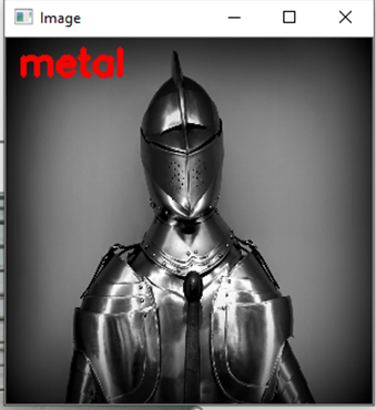
I trained and tested my code on images of metal and wood textures.
The results are pretty good for something so simple:

f:id:unifa_tech:20190704170921p:plain
Metal Siding

f:id:unifa_tech:20190704170943p:plain
Knight

f:id:unifa_tech:20190704171007p:plain
Flooring

f:id:unifa_tech:20190704171027p:plain
Odd Floors

Pretty straight forward seeing we are using sklearn's implementation. All we really need to do is create the histograms to get out the feature vectors for each image. This can allow for you to then classify other images that have similar textures on them.
As you can see it works pretty well. The first “wood” image is actually metal siding, but I wanted to see how well it does one something that is very difficult to determine. This misclassification could be due to the overall image looking similar to that of wood flooring texture and not of metal textures. Even a human might have the same issue with this using a black and white photo.

Conclusion:

The ability to extract small scale or fine grain details makes LBP a very handy tool for computer vision tasks. But, one issue is that LBP cannot capture at different scales which causes it to miss out on a global scale features. This can be overcome by using different implementations of LBP which can handle different neighborhood sizes which allows for better control over the scale. Depending on your need the use of a fixed scale or changing one might change.

All royalty free texture photos were retrieved from here
https://www.pexels.com/